Facebook
 X
X
 Pinterest
 Copy Link
20 Interior Styling Secrets from AD Stylists | Part 2
Real estate photography is not editorial photography, but I love these tips. They make any room ready for a close-up! I hope you enjoyed the first 10. Here the next 10! I hope you find an idea or two that you can use:
“Go-to AD stylists Colin King, Mieke ten Have, and Michael Reynolds reveal their tried-and-true tricks for turning pretty interiors into magazine-worthy rooms
Once upon a time, designers believed that good interior photography meant stripped-down rooms devoid of personality. The fewer personal effects in a room, the better, so that designers could highlight their work and provide a blank canvas on which potential clients could project their own lifestyles and aspirations. No more. Thanks to Pinterest, Instagram, and an increased demand for digital content that can be published quickly and easily, a stylist who can make a space feel unique and authentic to the homeowner is one of the most important people to have in your inner circle.
“The most interesting interiors are the ones where you get a strong sense that the space belongs to actual human beings with a point of view,” says stylist Michael Reynolds, who has lent his touch to homes that appear in AD. “Having someone who can visually interpret the space, that is seismic.” But even just knowing the tricks of the trade can help you score big points with magazine editors and clients alike. Here, three of AD’s interior styling pros—Reynolds, Colin King, and Mieke ten Have—share 20 secrets for creating magazine-worthy compositions.
Strike a Balance
Photo by François Dischinger
“I always try to find an expression of the polar opposite,” Reynolds says. “I always try and visually achieve a compositional state of balance. You want there to be dark and light in terms of energy.” Apparatus founders Jeremy Anderson and Gabriel Handifar’s kitchen, for example, is an exercise in contrasts, as seen in AD‘s October 2018 issue.
Play with Shadows
Photo by François Dischinger
Though this room in AD’s October 2018 issue is filled with inanimate objects, Reynolds introduced visual movement by playing with the positioning of the furnishings and art. “You can bring life into a dead room by the way you light it, with shadow and the way things are positioned,” he says
Dial It Up, or Tone It Down
Photo by François Dischinger
“You have to roll your sleeves up and do whatever the space demands,” says Reynolds. “I visually try to bring order to chaos, or sometimes I bring a bit of chaos to too much order. It’s all about creating a sense of yin and yang.” Reynolds achieved this balanced state in Jeremy Anderson and Gabriel Handifar’s eclectic dining room, as seen in AD‘s October 2018 issue.
Break It Up
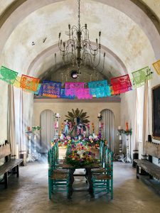
Photo by Douglas Friedman
“I like to create an installation of flowers down the center of the dining table to break it up into a few different pieces. And remove some of the chairs while still making it look believable. You lose the form of the chair if there are too many. You want to find that happy space,” recommends AD photo stylist Mieke ten Have. This dining room in the April 2019 issue of AD, for instance, is housed in a former chapel and is resplendent with flowers.
Find Your “Anchovy”
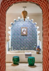
Photo by Douglas Friedman
“Find that strange, offbeat, bizarre thing that you can add to your tableau. I often come back to a saying the designer Thomas Jayne once shared with me: ‘It’s like adding an anchovy to a room.’ For example, I collect bird nests near my home and put them on bookshelves,” explains Ten Have. “But your anchovy can be something that you’ve picked up on travels, something found or discovered—not something found in a store. Maybe it even clashes. I hate it when things are matchy-matchy. It’s not interesting.” The “anchovy” in this bathroom, for example, is a 19th-century painting.
Unite Textures and Colors
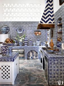
Photo by Douglas Friedman
“It’s always so beautiful to have vignettes with different values, whether that’s color, shape, or height, but there has to be another value that unites them, like texture or color,” says Ten Have. Take this vibrant tile-clad kitchen in Michelle Nussbaumer’s Mexico home, as seen in the April 2019 of AD.
Make Your Space Feel Lived-In

Photo by Douglas Friedman
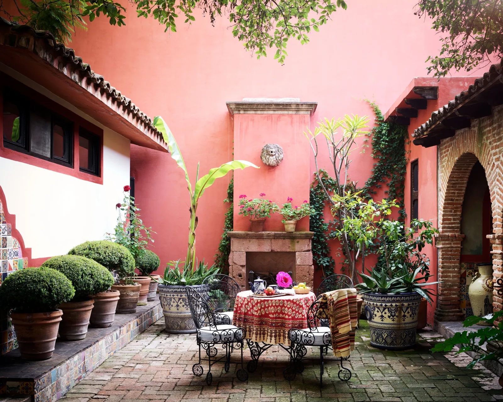
“Don’t anesthetize a space too much,” cautions Ten Have. “I like to make a space feel like it has an author, like it has an owner. You want to feel like the rooms are inhabited, not just a backdrop.” A shaded patio in designer Michelle Nussbaumer’s Mexico home, for example, feels like a lived-in oasis.
Always Incorporate Plants
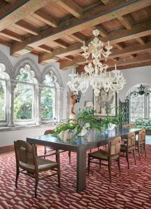
Photo by Ngoc Minh Ngo
“You can’t underestimate how important it is to have flowers or something living in a space. Just go and get some branches from right outside your door, or find something that’s living that’s of the landscape,” says Ten Have. Here, an unruly assortment of greenery brings this sumptuous dining room down to earth in AD‘s May 2018 issue.
Mind Your Color Palette
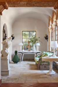
Photo by Ngoc Minh Ngo
“There are exceptions, but I do believe that colors should operate on the same wavelength: warm colors, cool colors, dusty colors,” says ten Have. “If you have a minimalist white backdrop of a room, you’re not going to have ebullient fuchsia peonies. Focus on a textural contrast rather than ostentatious color.” Take this warm, neutral color palette from the pages of AD‘s May 2018 issue.
Pile Lemons (or Artichokes) High
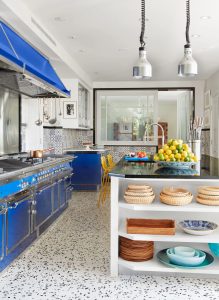
Photo by Ngoc Minh Ngo
“Artichokes are so beautiful and sculptural, and their texture is so elegant. Or I’ll do a bowl of lemons and limes for a bright pop of color—but I go big. I’ll get a big box of them,” says Ten Have. Portuguese tiles may be the star of this kitchen in AD’s May 2018 issue, but the piled-high lemons make it pop.”