Facebook
 X
X
 Pinterest
 Copy Link
Recently a July 2024 article written by Deborah Netburn and Christopher Reynolds, with contributions by Lisa Boone, popped up on my LA Times app. As they noted “A startling number of L.A. County’s most inspiring and entertaining structures went up in 1920s.” The county’s population grew exponentially from under one million to more than two million over the decade, resulting in a building boom.
You may recognize the buildings instantly, but I thoroughly enjoyed the brief history of each landmark. Here is their digital tour of architecture that epitomizes 1920s Los Angeles by year:
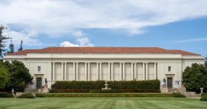
“1920: The Huntington Library
From The Huntington Library and Gardens website
Trains made Henry and Arabella Huntington rich, but books and art made them happy. So in 1919 they decided to channel wealth into a foundation focused on those things. The following year, workers completed the Huntington Library, soon to be joined by an art museum and botanical gardens, all on former ranch land in mostly rural San Marino.
The Huntingtons chose a beaux-arts design by Myron Hunt — a stately home for a book collection that was already close to 1 million volumes, including a Gutenberg Bible. To bring books and other treasures west from New York, current Library Director Sandra Brooke Gordon notes, Henry Huntington built a railroad spur to the property. Behind tall bronze doors, the 230-foot-long reading room featured floor of marble and cork, oak wainscoting, 30-foot coved ceilings and a set of windows on the south side — which, librarians soon realized, let in far too much light for a delicate book collection.
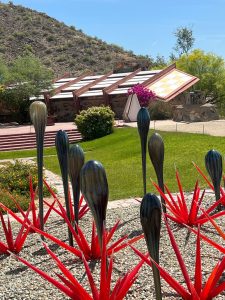
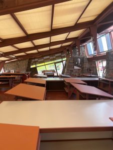
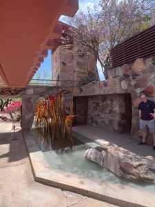
1921: Hollyhock House in Barnsdall Art Park
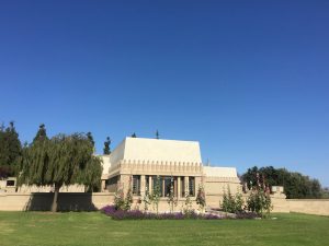
Photo from Kathy McDonald
Frank Lloyd Wright’s Hollyhock House rises atop Olive Hill like a modernist castle (with a moat where you’d never expect it).
This was the architect’s first California commission, designed for heiress Aline Barnsdall (who loved hollyhock flowers). Wright’s ideas here may leave you agog. Concrete doors. The moat? In front of the fireplace. Wright also designed some of the furniture and windows. Assistants on the project included Wright’s son Lloyd Wright, Rudolph Schindler and Richard Neutra, all on their way to architecture stardom.
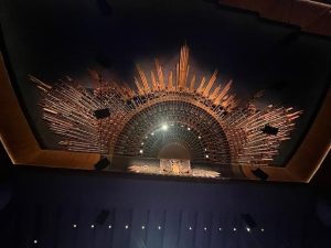
1922: The Egyptian Theatre
My photo of the ceiling of the restored Egyptian Theatre
Impresario Sid Grauman didn’t just open this theater with a bang. He created the Hollywood movie premiere, employing searchlights, red carpet and an emcee announcing celebrity guests. The building itself was inspired by the “Egyptomania” of the day. (This was the first of at least 10 U.S. theaters to open in the 1920s with Egyptian themes.)
Audiences passed from Hollywood Boulevard into an open-air forecourt. Hieroglyphics and lanterns marked the walls, which were sculpted to resemble stacked stone blocks. A sunburst design dominated the ceiling. Golden swans floated above the screen. (Five years later, Grauman would open his famed Chinese theater down the street.)
1923: The Biltmore Hotel
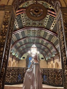
In the lobby and dressed for a costume party.
The palatial Biltmore Hotel was the largest hotel west of Chicago when it celebrated its grand opening with a gala for 3,000 in the fall of 1923. Built by New York hotelier John McEntee Bowman, the 11-story building was designed by architecture firm Schultze & Weaver, which also designed the Waldorf Astoria Hotel in New York. With its imported crystal chandeliers, carved marble fountains and decorative ceilings, the lavish building helped solidify a still young Los Angeles’ reputation as a world-class destination. Many of the hotel’s beautifully rendered murals and ceilings were painted by celebrated Italian artist Giovanni Battista Smeraldi, who also worked on the Vatican and the White House.
1924: The Culver Hotel
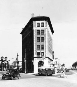
From The Culver Hotel website
Built in 1924 by real estate developer Harry Culver with financial help from actor Charlie Chaplin, the six-story, wedge-shaped Culver Hotel was designed by Curlett and Beelman, the local architecture firm behind several ‘20s-era buildings in downtown L.A. including the Pershing Square Building, home of rooftop bar Perch.
Advertised as Culver City’s first skyscraper when it opened a few blocks from MGM Studios, the hotel has its fair share of Hollywood lore. John Wayne once owned the building and Greta Garbo, Clark Gable and Buster Keaton all kept apartments there. Most famously, MGM put up the 124 actors who played the Munchkins at the hotel when they were shooting “The Wizard of Oz.”
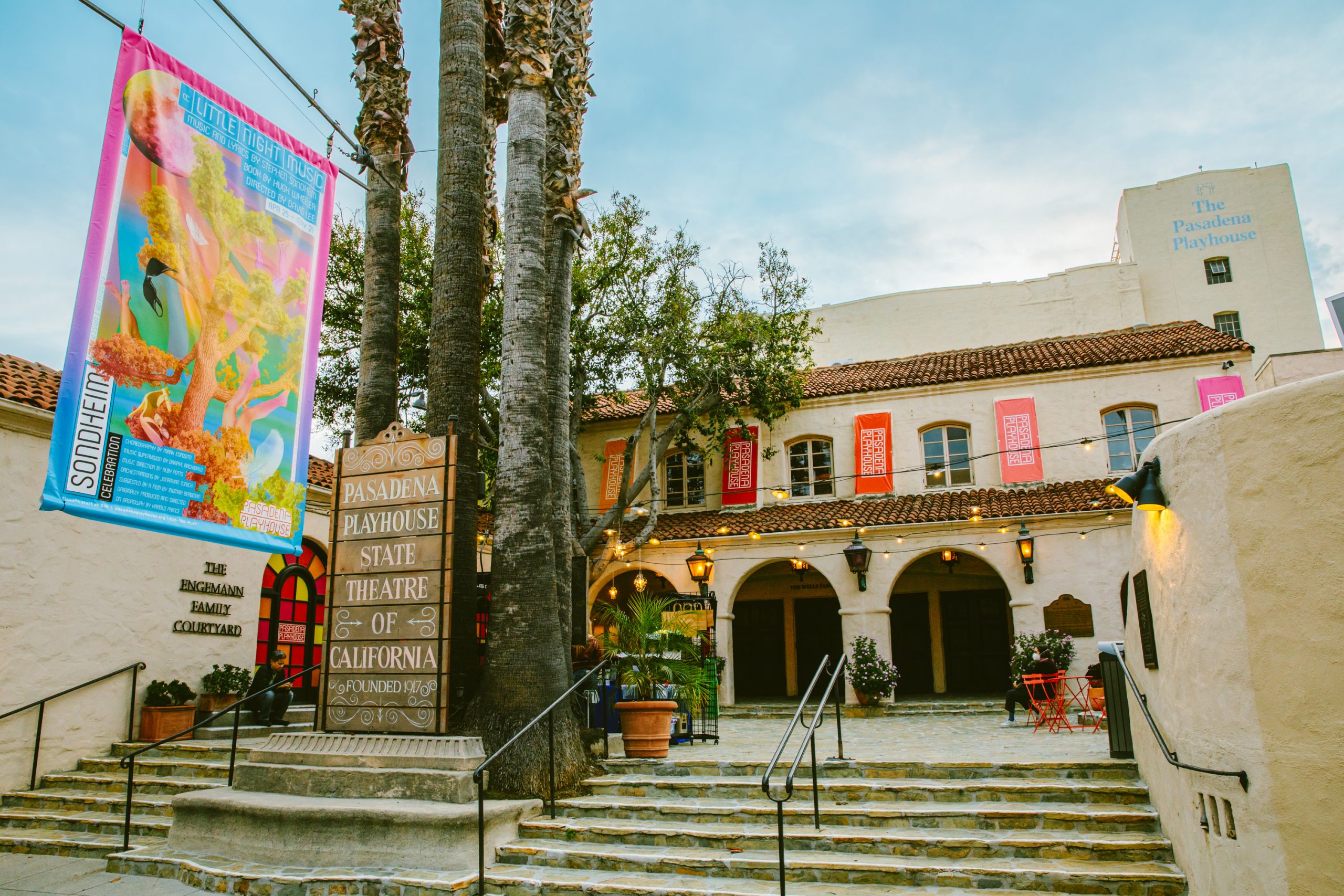
1925: The Pasadena Playhouse
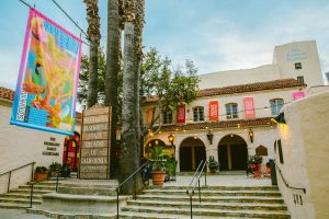
By Jeff Lorch, Pasadena Playhouse – pasadenaplayhouse.org,
From some angles, this theatrical collection of whitewashed walls and red roof tiles might look like another SoCal mash-up of Spanish Colonial Revival this and Mission Revival that. But this 1925 complex, designed by Elmer Grey to house the Pasadena Community Playhouse, marked a milestone for live theater in Southern California.
By 1939, playhouse leader Gilmor Brown had staged all 38 of Shakespeare’s plays, won designation as the state’s official theater, and had ventured into edgier contemporary material with a production of “Our Town.”
The theater’s courtyard served as an outdoor lobby, shaded by palm and fig trees. Indoors, above the seats, the ceiling seemed to be adorned with Spanish-style hand-painted tiles.
1926: The Hotel Figueroa
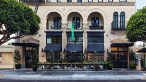
From Hotel Figueroa’s website
The 14-story Spanish Colonial-style Hotel Figueroa began its life as a feminist enterprise. Designed by the firm of Stanton, Reed & Hibbard, it was conceived and paid for by the Los Angeles chapter of the Young Women’s Christian Assn. as a haven for traveling businesswomen who could be denied lodging at other establishments if they didn’t have a male chaperone.
When it opened in the summer of 1926 the L.A. Times called the building “the largest project of its kind to be financed, built, owned and operated by women.” In the early years nine of the hotel’s 14 floors were reserved for women and it was run by the boundary-breaking Maude N. Bouldin, who flew planes, rode motorcycles and was reportedly the first female hotel manager in the United States.
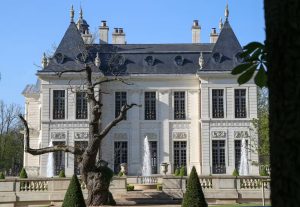
19927: Chateau Marmont
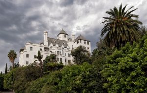
Photo by Michael Stuckey
Construction on the infamous and inviting Chateau Marmont began in 1927 on a wild hillside off of what was then a dirt trail known as Sunset Boulevard. Conceived by L.A. attorney and developer Fred Horowitz as a luxury apartment building for wealthy out-of-towners, the seven-story French-Gothic structure featuring spiky turrets, arched windows and steep roofs was modeled on the Château d’Amboise, a royal retreat in the Loire Valley.
Unfortunately for Horowitz, the stock market crashed eight months after the Chateau opened its doors in 1929. He sold it in 1932 to film pioneer Albert E. Smith, who transformed the building into a hotel while keeping the kitchens intact. The Chateau Marmont quickly became a favorite home away from home for actors, directors, writers and musicians for nearly a century. As filmmaker Billy Wilder famously said: “I would rather sleep in a bathroom than in another hotel.”
1928: Greystone Mansion and Gardens
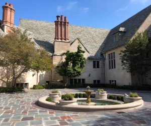
Photo from Michelle Ares/LA Dreaming’s 4/7/24 blog post
California’s first oil tycoon, Edward Doheny, made the money that built Greystone Mansion and Gardens. Architect Gordon B. Kaufmann designed the 55-room building, mixing Tudor and Jacobean styles, using stone arches and vaulted ceilings “on the grandest possible scale,” in the words of architectural historians David Gebhard and Robert Winter.
But there’s no masking the mansion’s dark history. On Feb. 16, 1929, five months after heir Edward Doheny Jr. had moved in with his wife, Lucy, and their five children, the bodies of Doheny and his secretary, Hugh Plunkett, were found in the house, fatally shot. Authorities ruled that Plunkett killed his employer and then himself, but speculation continues.
1929: Chapman Market
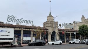
Photo by Alex
Despite its ornately carved exterior, red tile roof and pointy turret, Chapman Park Market was considered the height of modernity when it opened in 1929. Here was one of the first markets in the West designed for shoppers with cars. Patrons could drive through a Spanish Revival archway right into the center of the market and park in the courtyard to visit meat counters, vegetable markets, a flower shop, grocery stalls and a bakery.
Designed by architects Morgan, Walls and Clements, who also designed the Wiltern Theatre, the market’s other innovations included a sound system that announced bargains throughout the day and a central refrigerating system. The three-day grand opening included performances by a symphony orchestra and a troupe of Russian dancers.”


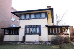 A Frank Lloyd Wright home, Getty image on left, in Chicago has been placed on a list of the most endangered historic buildings in the city, reports